
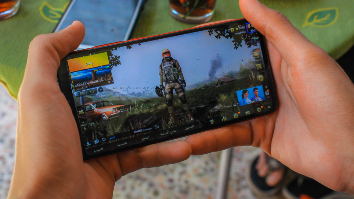
Most mobile gaming happens one-handed. Observational studies of handheld device use in public settings consistently show that people tend to interact with their devices using a single hand.
That’s the real reason one-handed UX matters. The difference between a mobile interface that feels smooth and one that feels frustrating is whether the game respects how you actually hold the phone.
Why One-Hand UX Matters
One-hand UX isn’t a “nice-to-have” tweak. It’s what keeps a mobile session feeling quick instead of fussy.
It matters most when the game asks you to commit to something, not just tap through menus. Think about the most common scenario: you’re on the couch or on a bus, phone in one hand, and you’re trying to decide whether to hit claim or back out. That decision is rarely about the button itself. It’s about whether the screen makes the terms obvious enough that you don’t feel like you’re guessing.
Bonus screens are the clearest example. A claim button is tied to rules that change the value of the offer, and what you need to know about casino bonuses is usually the same set of deal-breakers players look for: wagering requirements, time limits, which games actually count, and what you need to do before you can withdraw.
If the interface makes those essentials easy to spot and the next action easy to reach, the decision feels simple and confident. If it hides them behind cramped text and awkward button placement, you slow down, second-guess, and the whole one-hand experience stops feeling effortless.
Reachability Is Design, Not a Preference
A lot of mobile UIs still behave like the player is holding the phone with two hands, thumbs perfectly centered, ready to tap anywhere.
But one-handed play has a gravity to it. Your thumb has a comfortable zone, a stretch zone, and a zone you only hit when you’re annoyed enough to shuffle your grip. Great interfaces respect that reality. They keep the most-used actions low and easy, and they stop pretending the top corners are friendly real estate during real gameplay.
That’s why bottom navigation gives the best results. It’s why big, anchored primary buttons feel so much better than floating icons. And it’s why tiny text links for key actions almost always lead to mis-taps and drop-offs, not because players are careless, but because the layout ignores how thumbs naturally move across a screen, a pattern long observed in mobile thumb-zone behavior.
The UI Should Answer Every Tap
One-handed play amplifies uncertainty. With two hands, you can recover fast. With one hand, a mis-tap costs more because you’re already operating at the edge of comfort. So the UI needs to answer immediately.
That answer can be visual, like a pressed state, a quick animation, or a clear toggle. It can be tactile, through haptics. Or it can be structural, where the next screen clearly reflects what changed. The worst feeling in mobile UX is tapping and wondering if the app registered it. That’s when players double-tap, back out, or blame “lag,” even when performance is fine.
Players don’t expect that certainty by accident. Games have trained us for decades to trust input when the response is immediate and consistent, whether that feedback comes through motion, sound, or feel, the same arc you see in how controller feedback and input design have evolved over time. On mobile, the UI has to recreate that confidence with instant acknowledgement cues and clean state changes, so you stay in motion instead of stopping to verify what just happened.
One Wrong Tap Shouldn’t Break the Flow
Mistakes happen. On mobile, they happen even more because you’re playing one-handed, moving fast, and tapping with your thumb instead of a precise cursor.
So good design isn’t about making errors impossible. It’s about making them easy to undo. You should be able to back out quickly, spot what you just selected, and recover without feeling like you’re about to mess something up.
When “close” is shoved into the top corner, “confirm” is on the opposite side, and the screen is cramped, every tap starts to feel risky. You slow down. You hesitate. The whole game feels more stressful than it needs to, even for simple stuff like changing a setting or claiming a reward. Mobile UIs that feel good follow the same rule; they assume you’ll slip, and they make it painless to get back on track.
Conclusion
One-hand play is where mobile games either feel smooth or start feeling annoying fast.
When the important buttons sit where your thumb naturally rests, taps get an instant response, and each screen asks you to do one clear thing, the game feels quick and effortless, even if a lot is happening behind the scenes.
When you have to keep shifting your grip, reaching into corners, or guessing whether the tap even registered, the game stops feeling responsive. It starts feeling unreliable. And on mobile, that’s when people close the app and don’t come back.